Wednesday, 10 December 2014

Tuesday, 9 December 2014
Edit: 5
As the editing process continued, I could feel I was getting closer to finishing the product. After an encouraging response from our focus group I knew that it was largely completed, but certain things needed to be refined and sharpened. The section in most demand was undoubtedly the beginning with the white background. Despite showing all the key factors in chronological order, it was slow and didn't flow well. It was hugely important that this section works well as it is the opening of the video, so therefore has to engage the audience and encourage them to continue watching. In order to do this we wanted the instruments to be brought on in the video sooner. However, this was extremely difficult to coordinate as the entrance of the instruments where strictly cued and therefore could only come on at a certain point during the song. If I brought this forward in the song, then the audience would be able to see that the singer is heavily out of sync. However, I felt this change was important so I attempted to work around it. Logistically I would be able to use footage of all of the instruments, as long as I did not cut to a wide shot during the process as this would display the lead singer. This meant I had to take considerable time in shifting the footage and avoiding wide shots, and replacing them with mid shots and close ups that in some cases weren't even in the rough cut. This reinforces the importance of storing all rush footage within the software. Once I had established through the editing that all the instruments had been brought on, I was then able to return to the wide shots. This was a lengthy process and a tricky edit but I felt it was worth the time as it gives the opening section considerably more pace and makes it more watchable. During this process, I also decided to remove the shots of the lyric cards and the cigarette being brought on. I simply felt that these shots didn't work thematically and in conjunction with the rest of the video, especially considering that it is clear to see that it is not a real cigarette. Part of this overhaul was dictated by my decision to look at the video intently and decide whether every shot was completely relevant and was cut to for a reason. This helped me decipher what content was working. Aside from this, all I then had to do to this section was create the split screen effect we had planned and finally color correct the section so that the whites from the two different cameras we filmed on matched up. This final change made a huge difference to the effect of the video, making it look more refined and professional.
After this I then refined the recording studio cutaway by adding a different shot of Ben drumming. It is important to use as many different shots as possible over the course of the video to offer versatility. After this I moved onto to the final episode of the video in the black studio, which I re-cut slightly as there was one moment that included too many consecutive shots of Calum, the lead singer. Despite being the clear focal point of the group, it is important to break up the video with band footage. Finally, I reviewed the entire video with the intention of making the cuts more on the beat of the music, apart from shots that are purposely off-beat. To the untrained eye this would make little difference, but it heavily improves the natural and seamless look of the edit.
Furthermore, I purposely left in some diegetic sound at then end of the video once the actual track has finished. This is fairly common in music videos, as you can see in this video by the same artist that we are using - George Ezra. This video is littered diegetic sound that makes it more memorable and quirky. I left in the sound clip recorded on the day of the stylist spraying hairspray into the lead singers hair. I chose not to make this too loud as I personally feel it can become overpowering and therefore detract from the song, like in the 'Blame it On Me' video. One can also faintly hear a member of the crew complementing the take, before the drummer then releases his foot from the symbol pedal producing a sound, at which point the image cuts out. Having this moment of relative silence where we see the band after shooting a take reinforces our message - that this is a repeated and manufactured process.
Once completing these tasks, I felt confident that I had produced a finished product. Based on my immediate response, I am very happy with the video as I feel it effectively communicates our intentions and themes. I am proud that myself and Rachel have managed to produce a video of this quality and feel that even in the last week since our rough cut, the video has developed overwhelmingly to what we have now.
Rough Cut
Finished Video
Correcting the Digipak
After receiving critique from the focus group, myself and Rachel decided to rectify the problems that were raised during the meeting. The group made useful comments that could easily refine our product. Below are some annotated images detailing the adjustments we have made.


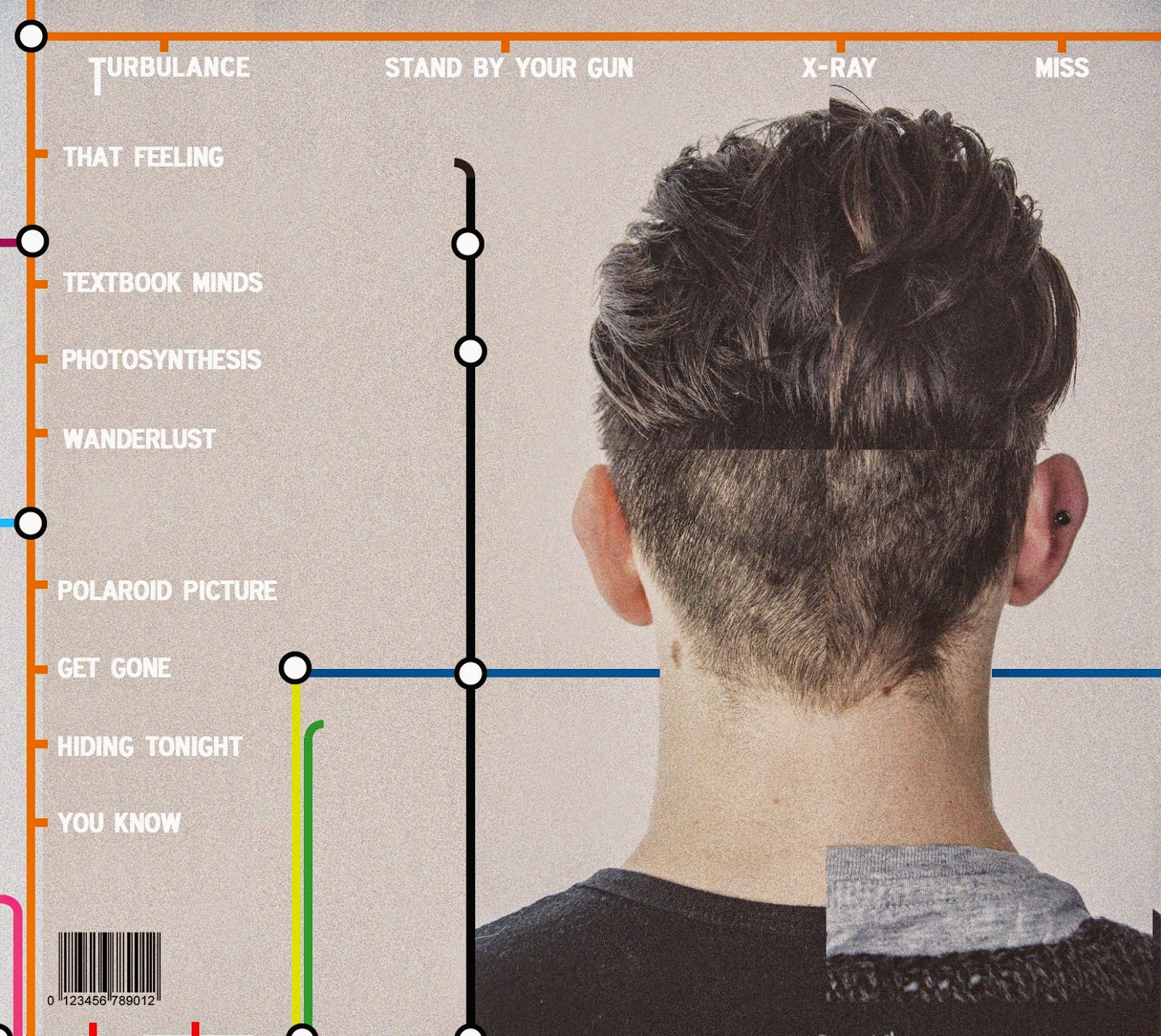
The back cover of the Digipak is what needed most work of all of them. As raised in the focus group, the back of the head was in fact on the wrong side of the panel and therefore did not correspond with the front. To rectify this we simply flipped the entire image horizontally in Photoshop. However, this consequently also flipped the text meaning we had to re-write the song titles. We also added some copyright information and a barcode, two features that make the cover look considerably more legitimate and true to real life.

The inner panel that holds the CD has changed the noticeably as we have reconfigured the width and layering of the lines to make it resemble the tube logo more effectively and therefore be more recognisable.

The main edit to this section was the boldness of the text which needed increasing to make it more eligible. We chose doing this over changing the font to black as we thought that it would then lack continuity with the front cover. I also came up with the idea of adding the band logo to the biography as a nice stylistic feature.
Thursday, 4 December 2014
Focus Group

Today was the day of the pre-arranged focus group, where we could gain some feedback from a key demographic of late teenagers that we could carry on into our continual development. We showed them the three key products (as shown in previous blog post) and questioned them on their opinions on each and then finally the products as a collection, based on their stylistic continuity. We recorded the entire session so that we could document it, allowing me to summarise the key points in three separate sections. There are obvious paused points in this clip where the group have been offered time to review the products individually. We deliberately showed the group the Digipak and website first, as the video itself is normally the biggest indicator of the genre of an act and we wanted to determine whether the group could guess this without it.
DIGIPAK
- All the people in the focus group raised their hand when questioned whether they liked the London Underground tube theme. They felt it was strong, visually identifiable and worked well with the Digipak, especially in the way the songs have been listed on the back cover.
- Someone mentioned that the biography was quite difficult to read due to the font used being quite faint in terms of its density. She suggested that this could be altered to make it more legible.
- When questioned on the genre of the band based on what they could see from the Digipak, someone mentioned that they thought it was quite 'poppy'. However, this individual was immediately met with disagreement with others strongly believing that it was closer to a rock band with a few mentioning the terms 'indie' and 'alternative' - just as we had hoped.
- I then asked them if it was clear what we had done with the faces on the Digipak. Many people responded by saying it was obvious that we had amalgamated the faces of what they presumed to be a band. However, one person suggested that that back cover should be flipped so that the heads were in the same place on either side of the Digipak. This was of course what we had intended but only realised that this wouldn't work when sticking them together. This is something we will have to alter before properly sending them to print. However, it is not a crucial problem.
- In conclusion, I asked them whether they liked it in general and this was met positively with lots of them thinking it was unique, different and interesting. As means of improvement one person mentioned he found the grey slightly boring so this is something we may consider.
WEBSITE
- We started by explaining the difficulties we had preparing the website and how it was the least developed of the products.
- One person described how it made them think of India due to the elephant being a key visual image on the homepage.
- One person described how they thought it was very alternative. She said that we are not going down a mainstream route and therefore it is memorable.
- The group once again reinforced how they liked the London Underground them.
- An individual mentioned how they would expect to see a picture of the band performing on the homepage.
VIDEO
- We outlined to the group that this is our first cut of the video and we were open to ideas about altering it. We were slightly pressed for time so this period of questioning wasn't as lengthly as I might of liked.
- When asked what they thought the video was about, one person immediately responded "The band". This may seem a fairly one dimensional response but is fairly accurate as the video does focus in on the band and their journey in the modern industry.
- A few mentioned how it was clear that they were all really good friends and it was nice to be able to see their personalities, most notably in the recording studio section.
- Someone proclaimed that they liked the way the video "builded" throughout. She said that normally you don't see this in music videos.
- One girl mentioned that she felt the last set up was like the 'final product', after seeing this gradual progression and getting know the band.
- I questioned what they felt about the 'mood' of the band. They all understood that the band were uncomfortable in the process of making the music video. It appeared this tone was clear as one person described "they loved music but not necessarily making a music video".
- One person criticised by saying that they couldn't see the London underground theme played out through the video as you might hope. However, he said the video wasn't too far detached from the other products.
- However, another individual claimed the video made it clear that they were a "English" band and that they are "alternative", and this was reinforced by the name.
Upon reflection, I am pleased with the way the focus group session went. We received some useful feedback on each of the products. People liked the Digipak, concluding that the visual theme was strong and iconic. This alone went some way in communicating the genre of the band effectively. The focus group could clearly identify that the website wasn't complete and needed work, so I feel they therefore withheld critique which they may have otherwise put forward. Despite responding positively to some of its features, one person interestingly suggested that they would expect to see images of the band. We had planned a 'Media' page which would without doubt include lots of pictures of the band, but this was in the previous draft of the website. Contrary to the individuals belief, our research shows that home pages for bands of similar genre (The Kooks, Alt-J) are normally dedicated soul to graphic design as opposed to pictures of the band. This is something we may trial further before making a final decision. In terms of the video, the response was largely very positive with the majority of people understanding it thematically and having little criticism. Some mention that they couldn't identify a continuation of the London Underground theme within the video which is a fair point. This is not something we can alter as the shoot date has passed. However realistically, this is a single music video for one of the songs from an entire album. This means it is unlikely that the bands management would style a whole website and Digipak solely around one video. The music videos that accompany that album are the products that are most likely to show versatility in the real world. In conclusion, I am glad we had this opportunity. It is quite easy when creating things that you are constantly working on to become immune to their effect. This group gave us 'fresh eyes' and the opportunity to use new opinions to go forward.
Wednesday, 3 December 2014
Edit: 4 / Development & Preparation for Focus Group
With our focus group date approaching, myself and Rachel decided that we would speed up the process of product development by splitting up the work. Up until now, we had done everything together. This has worked thus far but now there was slightly more pressure to produce. We decided that I would take soul responsibility for the continual editing of the video, whereas Rachel would control the progress of the Digipak and website. We would both continue to have input in this development and would refer any changes we have made to the other group member.

In terms of the editing, I continued to cut the video - now picking pace after becoming more aquatinted with the footage and software. I decided I would cut the video on three separate timelines, decided by the three different obvious sections of our video. This made the process more structural and organised, like 'building blocks'. My aim was to complete a rough cut of the video before the focus group. The hardest of these sections to finish was the infinity background section. This was due to the array of continuity complications that this brought with it. Furthermore, the editing took a greater chunk of the video than we expected meaning we had to make the decision to cut some elements we had filmed, such as the green screen. This meant that we could still cut to the recording studio footage at the same point in the song, which I thought was more important for the concept of the video. However, once completing this I was then able to proceed with the other two sections that were considerably easier to cut together due to them being largely basic performance footage. With our recording studio cutaway, I had to search through lots of footage to find the most natural moments of the band to show their personality. I was really happy with this section as I felt it created some nice contrast with the other two, more much more produced setups for the video. Finally, I arrived at the black studio setup which allowed me to edit in a more expressive way due to the free flowing, tracking shots. This gives the video visual zest and allows it to stray away from the very 'flat on' style featured at the beginning. Without doubt, certain things about the video still need to be altered. The white balance for some of the shots still needs to be colour corrected. This is once of the last things I will do in the editing process. The white studio section of the video still needs to be sharpened meaning we may have to add some other footage or simply switch things around slightly. Furthermore, we were unable to get round to inputing the 'split screen' effect with the band members head and shoulder shots, as we had storyboarded just before the recording studio cutaway. This is perfectly achievable, and is something we can do at a later date. This is responsible for the held shots of both Joe and Ben in the rough cut. Otherwise, I am happy with what I have been able to achieve in a relatively short space of time.
After reaching a decent stage as a pair, Rachel continued to make developments with the Digipak on her own. The designs for these panels have been set for a while, so after our photographic work had been completed to a good standard, Rachel just had to add the graphic design elements. She first added the London tube theme, using sporadic colourful tube lines that she created herself. These were careful interwoven around the images before adding the text, in a bold and simplistic font. We decided we would keep the grey from the original images as we liked the industrial look and felt it contrasted nicely with the more vibrant colours of the tube lines.
After reaching a decent stage as a pair, Rachel continued to make developments with the Digipak on her own. The designs for these panels have been set for a while, so after our photographic work had been completed to a good standard, Rachel just had to add the graphic design elements. She first added the London tube theme, using sporadic colourful tube lines that she created herself. These were careful interwoven around the images before adding the text, in a bold and simplistic font. We decided we would keep the grey from the original images as we liked the industrial look and felt it contrasted nicely with the more vibrant colours of the tube lines.
FRONT COVER

BACK COVER
INNER PANEL

INNER PANEL

After finishing a rough draft of the Digipak that we were very happy with, we decided we would print this off in the correct sizing before then clueing and and sticking the panels together. This is not of the same quality as the final version will be, yet nevertheless it is in a physical format and gives the focus group the oportunity the hold it and view it in its desired form.

Furthermore, Rachel made key changes to the website also. Although we really liked the design that we had previously with the oil painting acting as a backdrop, it lacked continuity with the Digipak and they looked as though they represented two separate acts. Due to this, we made the decision to re-format the website and continue the Underground them on the web. Due to this change, Rachel wasn't able to complete as much of the website as she had done previously meaning we could only prepare a homepage, and one that still needs considerable work. However, we had a clear intention with this meaning the focus group will be able to see what direction we are going in with the website.

As you can see, we now have three well prepared and interesting products which we can display to our focus group tomorrow and gain some useful feedback.
Re-Designing the Logo

Both myself and Rachel liked the logo we had found on the internet - to be symbolic of the bands name as act as their key piece of iconography. However, we wanted to adapt this logo and make it our own in some way. We also felt that it was slightly too messy and wanted to condense it down into something more minimalistic.
Rachel decided she would draw the image onto a plain piece of paper using a much more basic design with less tonal lines. This made the image look more abstract and almost cartoon like, as opposed to the more textually real original.


She then scanned the image and uploaded it into photoshop. Rachel adjusted the contrast and a few other features to make it more bold. She used the eraser tool to get rid of certain marks caused by the scanner. Following on from this, she used the 'Background Eraser' tool to delete the background enabling us to remove the white background and then place it on the website without a boarder. After doing this, we are now able to use this logo in whichever way we wish and use it to show continuity with our following two products.
Monday, 1 December 2014
What is a focus group?
A 'focus group' is a well established method within the business world of gaining information about a product. The aim is to display products in a way that does not direct an audience in order to gain as much impartial feedback as possible. This information can then be used to build and improve the effectiveness of a product and make it more appealing to a target audience. We plan to share rough cuts of all three of our products, to gain some constructive responses from a group of people that have been arranged for us.
We analysed some video clips in class of both good and bad quality focus groups to gain a comprehensive knowledge of a decent technique. There are specific characteristics that will improve the quality of feedback. It is important to direct the audience to key issues of the product, while also asking open questions instead of only asking about what you want to hear. This will help in gaining an overall opinion as opposed to more specific analysis. You must listen and write down everything that is said. This is not an opportunity to sell the product, you are simply trialling the effectiveness. Gaining criticism is important, as this session should not just act as a confidence boost for the group. It is also hugely important not to disregard, interrupt or try to defend yourself against peoples opinions. Everything should be considered valid and not taken personally. This can often prove to be a problem with this exercise, which is why in the real world separate companies are often employed to run focus groups as they are not attached to the product and are capable of remaining neutral during the process.
In terms of preparation for this exercise, we will print of a rough copy of our Digipak. This will be printed out to the right size so that we can achieve the an accurate physical representation, as this this is the only of the three products that will end up being an actual physical object. We will publish our progress with the website online so that group can view this in its natural form meaning they can see how easy it is to use as a technological platform. We will also export a rough cut of how far we have got with the music video onto Youtube, meaning they can watch it on the big screen. We also began to consider some of the questions we might ask to the people on the day e.g.
- What is the genre of the band? (Show Digipak and Website first as the video is the biggest indicator of the genre).
- State 5 words to describe the bands star image?
- What do you think the video is about?
- Do you see any major differences between the way the products represent the band?
We will film the focus group in order to achieve a thorough and accurate account of events, that is un-biased and in edited. However, this will not be on a large, high quality camera as this may effect that natural responses of the group. The group we will be presenting to are not our usual class meaning they no nothing about our products and also won't stretch their opinions due to personal relationships.
Subscribe to:
Posts (Atom)