With our focus group date approaching, myself and Rachel decided that we would speed up the process of product development by splitting up the work. Up until now, we had done everything together. This has worked thus far but now there was slightly more pressure to produce. We decided that I would take soul responsibility for the continual editing of the video, whereas Rachel would control the progress of the Digipak and website. We would both continue to have input in this development and would refer any changes we have made to the other group member.
In terms of the editing, I continued to cut the video - now picking pace after becoming more aquatinted with the footage and software. I decided I would cut the video on three separate timelines, decided by the three different obvious sections of our video. This made the process more structural and organised, like 'building blocks'. My aim was to complete a rough cut of the video before the focus group. The hardest of these sections to finish was the infinity background section. This was due to the array of continuity complications that this brought with it. Furthermore, the editing took a greater chunk of the video than we expected meaning we had to make the decision to cut some elements we had filmed, such as the green screen. This meant that we could still cut to the recording studio footage at the same point in the song, which I thought was more important for the concept of the video. However, once completing this I was then able to proceed with the other two sections that were considerably easier to cut together due to them being largely basic performance footage. With our recording studio cutaway, I had to search through lots of footage to find the most natural moments of the band to show their personality. I was really happy with this section as I felt it created some nice contrast with the other two, more much more produced setups for the video. Finally, I arrived at the black studio setup which allowed me to edit in a more expressive way due to the free flowing, tracking shots. This gives the video visual zest and allows it to stray away from the very 'flat on' style featured at the beginning. Without doubt, certain things about the video still need to be altered. The white balance for some of the shots still needs to be colour corrected. This is once of the last things I will do in the editing process. The white studio section of the video still needs to be sharpened meaning we may have to add some other footage or simply switch things around slightly. Furthermore, we were unable to get round to inputing the 'split screen' effect with the band members head and shoulder shots, as we had storyboarded just before the recording studio cutaway. This is perfectly achievable, and is something we can do at a later date. This is responsible for the held shots of both Joe and Ben in the rough cut. Otherwise, I am happy with what I have been able to achieve in a relatively short space of time.
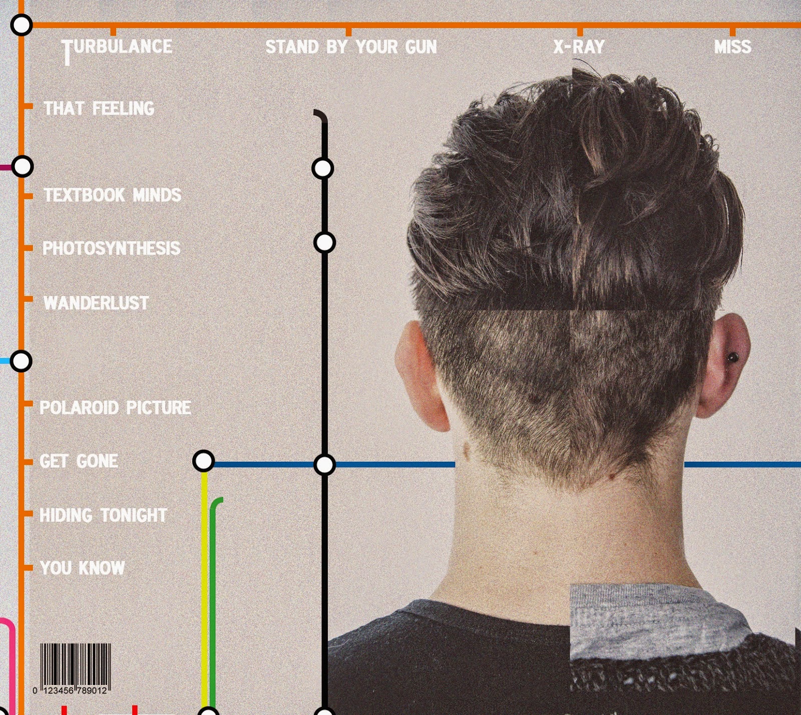
After reaching a decent stage as a pair, Rachel continued to make developments with the Digipak on her own. The designs for these panels have been set for a while, so after our photographic work had been completed to a good standard, Rachel just had to add the graphic design elements. She first added the London tube theme, using sporadic colourful tube lines that she created herself. These were careful interwoven around the images before adding the text, in a bold and simplistic font. We decided we would keep the grey from the original images as we liked the industrial look and felt it contrasted nicely with the more vibrant colours of the tube lines.
After reaching a decent stage as a pair, Rachel continued to make developments with the Digipak on her own. The designs for these panels have been set for a while, so after our photographic work had been completed to a good standard, Rachel just had to add the graphic design elements. She first added the London tube theme, using sporadic colourful tube lines that she created herself. These were careful interwoven around the images before adding the text, in a bold and simplistic font. We decided we would keep the grey from the original images as we liked the industrial look and felt it contrasted nicely with the more vibrant colours of the tube lines.
FRONT COVER
BACK COVER
INNER PANEL
INNER PANEL
After finishing a rough draft of the Digipak that we were very happy with, we decided we would print this off in the correct sizing before then clueing and and sticking the panels together. This is not of the same quality as the final version will be, yet nevertheless it is in a physical format and gives the focus group the oportunity the hold it and view it in its desired form.
Furthermore, Rachel made key changes to the website also. Although we really liked the design that we had previously with the oil painting acting as a backdrop, it lacked continuity with the Digipak and they looked as though they represented two separate acts. Due to this, we made the decision to re-format the website and continue the Underground them on the web. Due to this change, Rachel wasn't able to complete as much of the website as she had done previously meaning we could only prepare a homepage, and one that still needs considerable work. However, we had a clear intention with this meaning the focus group will be able to see what direction we are going in with the website.
As you can see, we now have three well prepared and interesting products which we can display to our focus group tomorrow and gain some useful feedback.


No comments:
Post a Comment